

Branding for a strong presence
For the newly founded marsa Treuhand Anstalt, we developed a holistic branding concept, from logo creation to the implementation of the first brand applications. The goal was to create a visual identity that conveys trust, stability, and security.
The company name had already been defined and became the conceptual starting point of our work. “Marsa” means “harbor” or “anchorage”, a place where one arrives safely. This meaning became the guiding idea behind the visual identity.
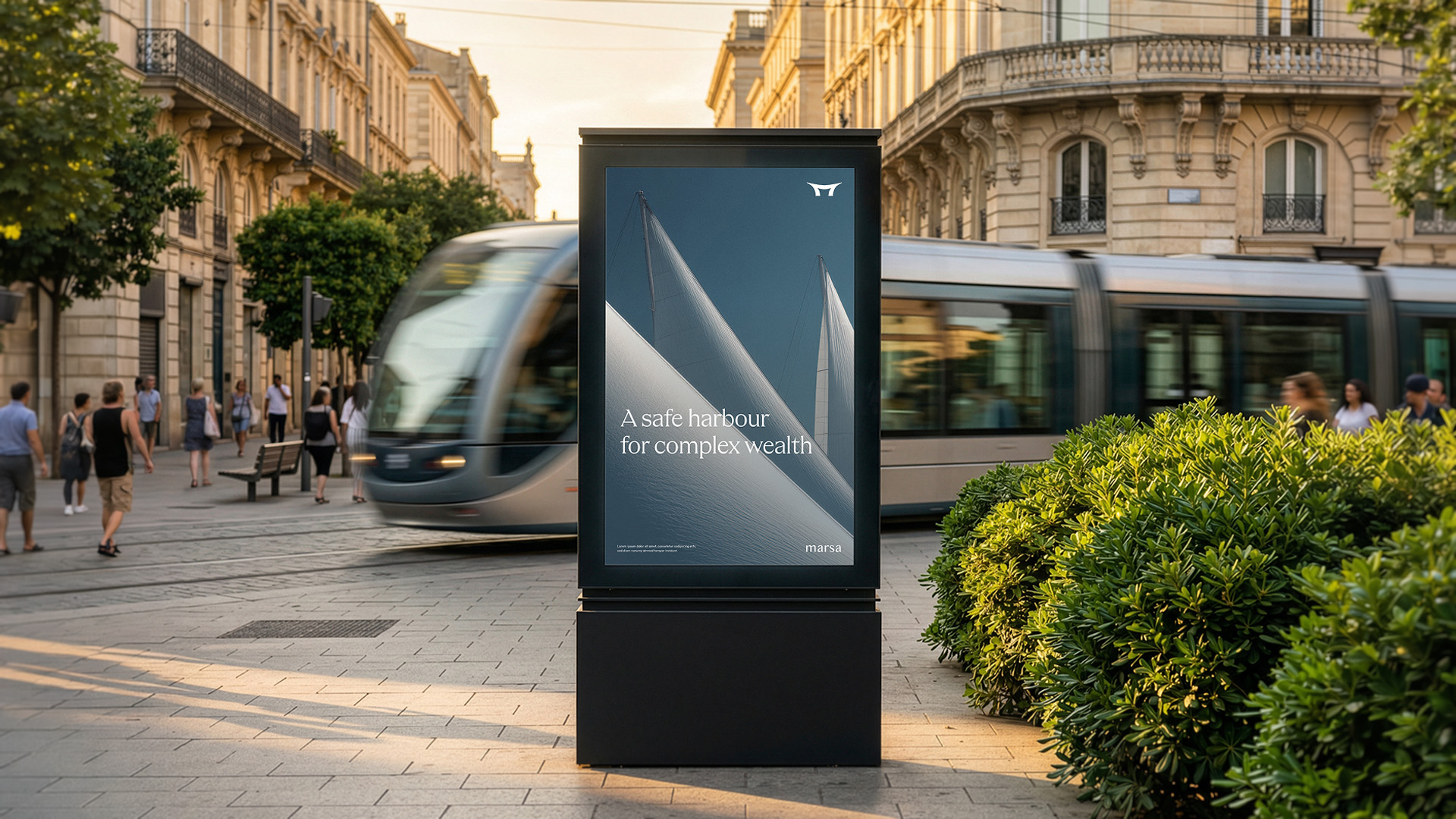

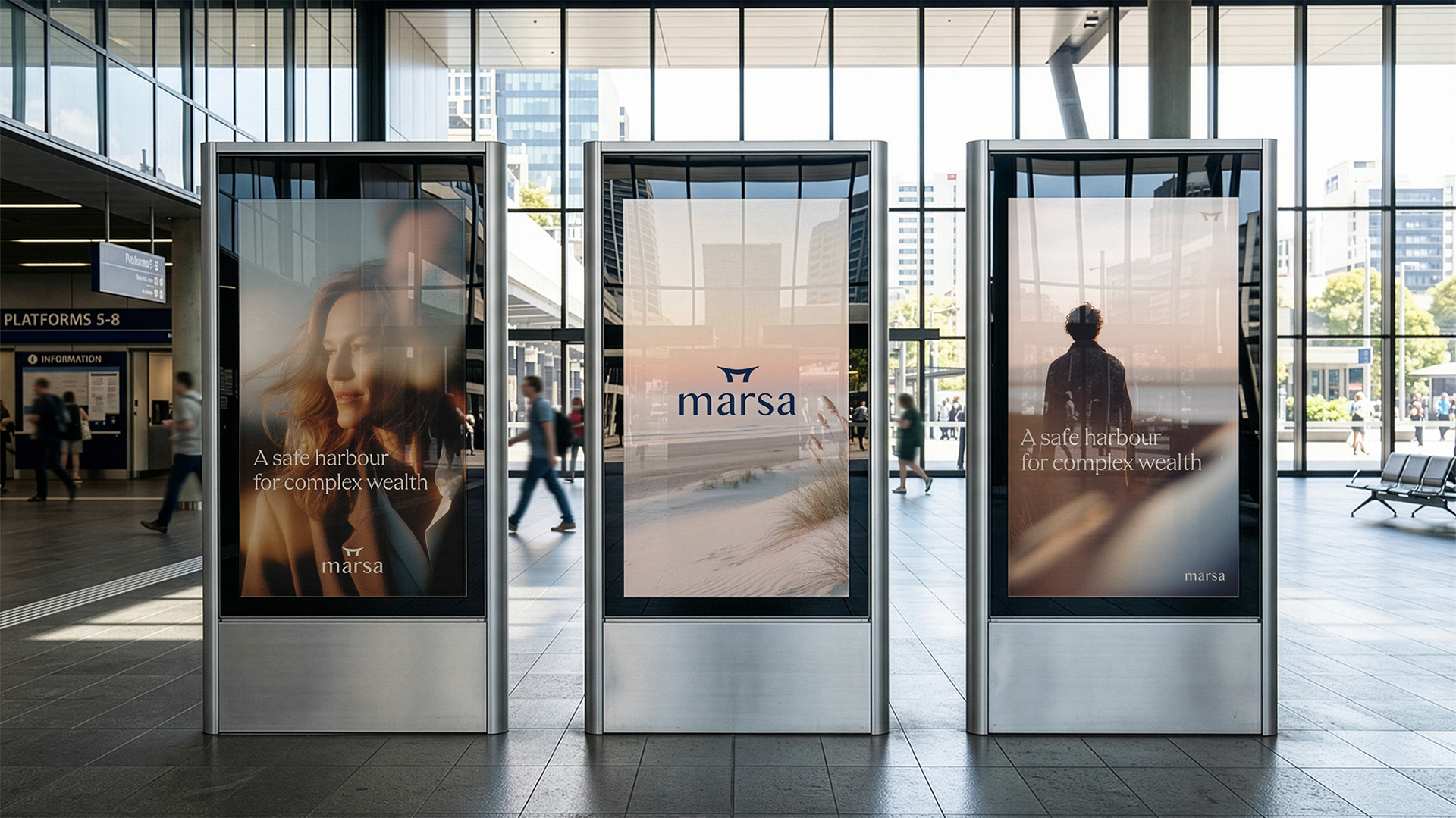
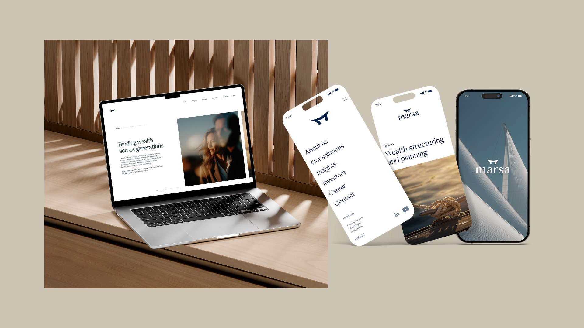
At the core of the project was the development of the logo: the wordmark is complemented by an icon in the form of a cleat, a nautical element symbolizing support, stability, and reliability. The combination of name and symbol metaphorically conveys that clients find a safe and dependable place for their concerns at marsa.
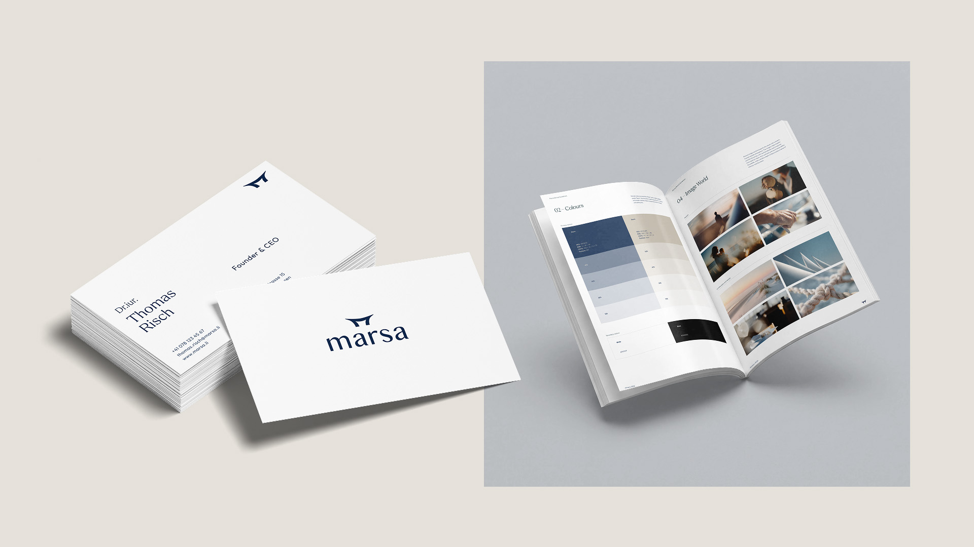
Building on the logo, we defined the remaining elements of the corporate design. This included the selection of typography, color palette, and visual style, as well as the development of a consistent visual system that positions the brand clearly and recognizably.
Finally, we supported marsa in the implementation of various brand applications and assisted in the realization of the first communication materials, ensuring that the new brand identity was translated into practice in a consistent and high-quality way.

A Leading Creative Agency for Strategic Brand Storytelling and Communication Design based in Zurich.
.svg)


